

Google Trends is often used as a one-off: drop in a keyword, stare at the line, close the tab. I used it that way too. I thought it was a tool that took things I already knew and wrapped them in a graph.
I realized I was wrong while planning October content. The seasonal curve had been telling me what to publish months earlier. I had just been reading it like a weather map I couldn't change.
Google Trends is not a keyword discovery tool. It is a calendar. And right now in Japan, the highest mark on that calendar is autumn.
Let me explain how it actually works. Most guides skip this part.
What Google Trends Measures — and What It Doesn't
The numbers on the vertical axis are not search counts. Google divides each data point by the total searches for that region and time period. It then scales the result to a 0–100 range, representing that topic's share of all searches (Google Trends Help).
That single sentence explains most of the confusion around this tool.
- 100 is not a fixed number of searches. It means the peak for the selected period.
- The same term showing the same value in two countries can represent completely different actual search volumes.
- Zero does not mean no searches. Google only shows data for terms that are popular enough.
- Google excludes some searches: repeated queries from the same person in a short time, queries with special characters like apostrophes, and internal searches from AI mode and AI overviews.
Google also deliberately mixes in statistical noise for privacy protection. The lower the search interest, the more visible the noise, and one-off spikes you see there may not reflect actual search behavior (same source).
That is why I now read the curve's shape, not its height. Is it rising, flat, or falling? Does it rise at the same time every year? When I need to gauge scale, I follow Google's own advice and compare it against a baseline term that is always searched — like types of food, celebrities, or weather.
This is the entire reason to look at the calendar.
Google recommends finding seasonal patterns in Google Trends, then publishing quality content slightly before people start searching (Google Search Central).
It sounds obvious. And it's also the step most teams skip. Publication happens when the writer has time, not when the curve rises. I think many of us have have done this. We published an autumn article in November, watched it grow for the last two weeks of the season, and understood exactly what we had missed in October.
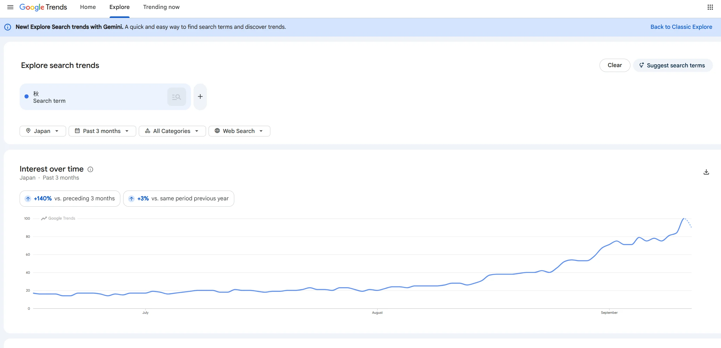
For example, if you look at the results for 「秋」 (Autumn in Japanese) you can see that it is already facing it's peak.
Google's own example makes the mechanism clear. They use Brie cheese, which has strong seasonality — twice a year in the US, once in the UK (same source). Same food, different calendar, different content plan. Seasonality is not a property of the topic. It is a property of the market.
How to Read a Seasonal Curve: The Steps
Here is the order I follow, with the source for each step.
-
Choose a topic, not a search keyword. When you enter a term in Google Trends, you get a choice between "Search term" and "Topic." Google's own tips recommend choosing Topic whenever possible, because topics are language-independent and group together spelling variations, misspellings, and alternate names (15 Tips for Using Google Trends). This matters for Japanese seasonal words. 紅葉, もみじ, and こうよう are three spellings of one theme.
-
Set the period to five years. One year shows winter once. Five years shows whether peaks are early or late, and whether they are shifting. Google's timeline goes back to 2004.
-
Add a baseline term. Include one boring term that is always searched. This is also Google's advice. Without a baseline, a small topic's hill and a massive topic's hill look the same shape. For example, if you plot "autumn foliage" alongside "weather," you can see how large the foliage spike is relative to a term that is searched every day.
-
Apply the region filter. You can filter by country, prefecture, or city. For location-based themes, the answer changes. Cherry blossoms in Tokyo and Hokkaido are not the same content plan.
-
Open Related Topics and switch between "Top" and "Rising." These tabs sit below the interest-over-time graph. "Top" shows queries that are consistently searched alongside your topic — they reveal the surrounding context. For "autumn," you will see seasonal food, travel destinations, and fashion terms that always cluster around this season. This tells you what content already exists in the searcher's mind. "Rising" shows queries that have grown significantly in the selected period. These are early signals — terms that did not matter last year but are spiking now. A query appearing in "Rising" for autumn content might be a new product category, a viral destination, or a cultural moment you would otherwise miss. Switch between the two tabs. Start with "Top" to map the landscape, then check "Rising" to find gaps your competitors have not covered yet.
-
Read the peak and work backward. The peak is when demand arrives. The publication date comes before that.
Two Changes to Google Trends in 2026
This year's updates made calendar reading faster.
In January 2026, Google redesigned the Explore page and embedded Gemini in a side panel. It finds related trends automatically and compares them for you. It auto-populates up to eight search terms on the graph, and doubled the number of rising queries shown on each timeline (Google Official Blog). For seasonal planning, this is practical. Ask about autumn foods, and it surfaces adjacent terms you would not have thought of.
In July 2026, period comparison was added directly inside Google Trends. Chips appear above the timeline showing week-over-week, month-over-month, and year-over-year change rates. One click overlays the comparison line on the graph (Affiverse analysis).
For autumn planning, the year-over-year chip is the one that matters. Month-over-month only tells you "autumn is busier than August," which you already know. Year-over-year tells you "this autumn is ahead of or behind last year's." That is a number you can plan with.
Building Japan's Autumn Calendar
Autumn in Japan is not one season. It is a bundle of overlapping seasons from late September through December, each with its own rise pattern.
The starting point is holidays. In 2026, Respect for the Aged Day falls on September 21, and the Autumn Equinox on September 23. September 22 becomes a national holiday between them, creating a five-day weekend from September 19 to 23 (National Astronomical Observatory Calendar). The equinox is also the middle day of the Obon-related Higan period. The custom of visiting family graves means demand for flowers, offerings, and travel home shifts during this week.
After the holidays comes the autumn foliage, moving south from the north. Hokkaido peaks early; Kanto and Kansai peak from late October into November.
Behind the foliage come the commercial peaks. September 25 for moon-viewing, late October for Halloween, mid-November for year-end tax adjustment, November 27 for Black Friday, and December for New Year's cards and year-end travel.
None of these should be read at the national average. Run them prefecture by prefecture. Hokkaido's rise and Fukuoka's rise are weeks apart. This is not overcaution. Google's own Brie example demonstrates the same principle.
Reading an Actual Curve: The "Autumn" Example
Let me apply the steps above to actual Google Trends data for Japan. Keyword: "秋" (autumn). Period: past 5 years, Japan, Topic search.
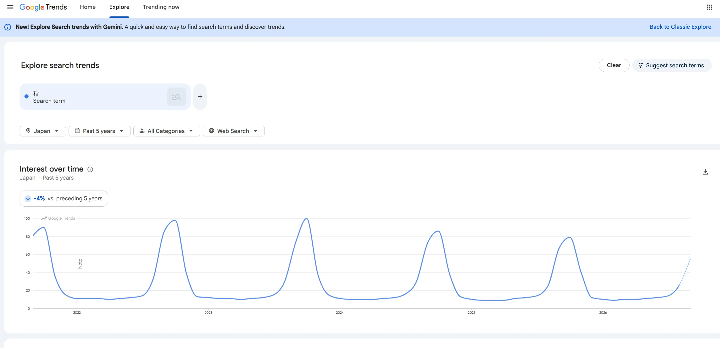
Open the five-year graph and the same shape appears every year. Winter through spring bottoms out around 10–12, nearly flat. As autumn approaches, interest surges sharply. The peaks have been declining slightly year by year: 100 in 2023, around 85 in 2024, around 78 in 2025. Overall trend for the past five years is down 4%. The 2026 line is dotted, showing mid-season data at roughly 55 in September.
Zoom to the past three months and you see the speed of the rise. July and August stayed flat at 15–25. September surged sharply, reaching nearly 100. Compared to the previous three months: +140%. Compared to the same period last year: +3%. The near-flat year-over-year means this autumn is arriving at roughly the usual pace.
By region, autumn interest is highest in Akita, Iwate, Nagano, Shimane, and Okayama prefectures. Northern and inland prefectures dominate the top. This overlaps with temperature patterns.
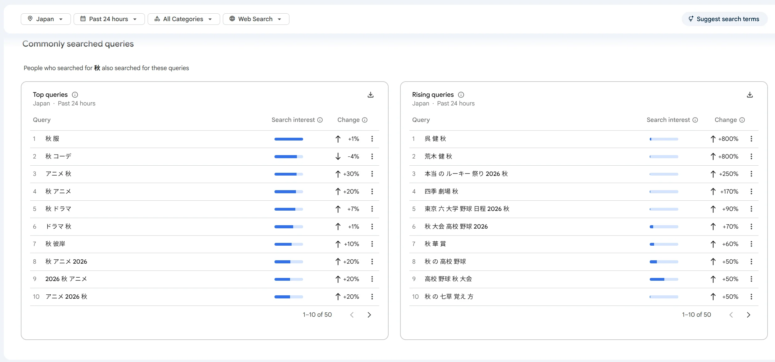
Read the related queries too. Top queries include "秋の" (+20%), "イエベ 秋" (+200%), "天皇賞 秋" (+50%), and "秋花" (+30%). Meanwhile "秋 コーデ" is down 50%. In Rising, "アニメ 2023 秋," "アニメ 2024 秋," and "アニメ 2025 秋" all record BREAKOUT growth — meaning over 5,000% surge. Seasonal content with year numbers rises automatically as new queries every year.
Three things emerge from this data. First, autumn demand surges in September and peaks in October–November. Second, timing shifts from north to south, but the searches themselves lead in inland and northern prefectures. Third, within the same "autumn" umbrella, demand structure is shifting: fashion is declining, while personal color, anime, and horse racing are growing.
How to Read Autumn Content from the Curve
Shape first, theme second. This is how actual planning works.
- Fixed date, one sharp spike per year. Respect for the Aged Day gifts, Halloween costumes. The date doesn't move, so the design is stable and calendar scheduling is easy. Publish 2–3 months before the peak and swap the year number annually.
- One rise, spreading over six weeks, shifting by region. Autumn foliage spots. Prefecture filters and regional pages work here. Don't write one national article.
- Slow rise across the whole season. Autumn for reading, autumn for appetite, autumn excursions. Broad, nearly year-round. Weak urgency to publish today, but good for building thematic depth.
- Date set by the calendar, one sharp spike per year. Higan grave visits, moon-viewing. Dates shift slightly each year because they are astronomical, so confirm rather than assume.
- Starts in autumn, peaks in winter. Dry skin countermeasures, influenza, year-end parties, year-end tax adjustment. The trap is publishing at the winter peak. These should go out in October.
- Flat year-round with only small bumps. Themes whose shape is nearly horizontal. If seasonality is not the main axis, stop forcing a seasonal angle.
That last point matters as much as the others. Putting seasonal clothes on a topic with no seasonality creates pages nobody needs.
My Publishing Timing Rules
From what I have gathered, content publishing timing splits into two tracks based on whether the page already exists.
| Content | Publish | Reason |
|---|---|---|
| New article | 2–3 months before peak | Crawling, indexing, and ranking settlement take time |
| Existing article rewrite | 1 month before peak | Already indexed, so updates reflect quickly |
| Social / newsletter | 1–2 weeks before peak | When users start looking |
To be honest, if our blog has zero autumn articles as of this article's publication date of September 15, 2026, even publishing a new article now would miss the 2026 foliage season. The foliage curve has already started rising. Updating existing autumn pages now and quietly nurturing new articles for next year would be the better move.
Where Google Trends Stops Being Useful
Know two limits.
First, Google Trends shows relative interest, not search volume or search intent. A rising line does not tell you whether the searcher wants to buy or to read. That is the domain of keyword tools and your own analytics.
Second, search demand is only half the picture. After users arrive, you need to see which path they took to get there. This is a channel problem, not a search problem.
One operational note on verification. Google Search Console retains performance data for 16 months. Each new day pushes out the oldest day. The window slides forward; it does not expand (Analytics Help). Year-over-year is the deepest comparison this tool gives you. If you want to compare this autumn with the autumn before last, you need to record peak numbers yourself, month by month. Start now. Also, recent Search Console data is provisional and subject to change. It appears as a dotted line on the graph (Search Console Help).
What to Do This Week
- Pick five seasonal themes tied to what you actually sell or write about.
- Enter each as a Topic in Google Trends, run it for 5 years, Japan, with a baseline term.
- Open the year-over-year chip and record whether this year is ahead or behind.
- Open Related Topics on "Rising" and pick out upward terms you would not have thought of.
- Work backward from the peak to set each publication date.
- Export the data or take screenshots. This is the only way to check year-over-year next autumn.
Autumn is roughly ten weeks long, and it is already running. The curve told us when it started. Now we just look at the calendar, not the Y-axis.